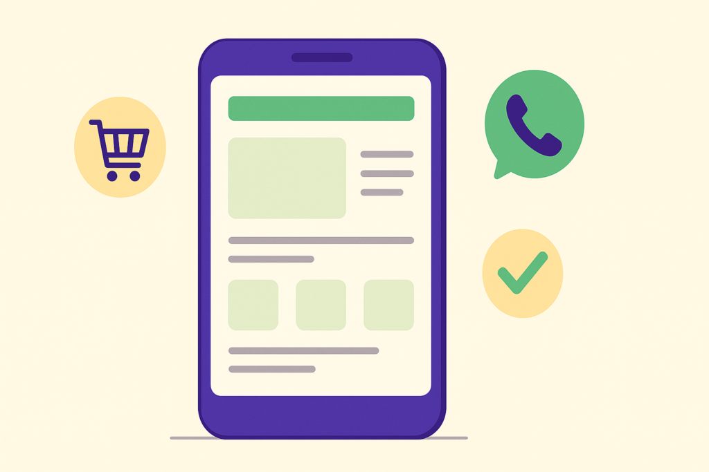
Most of your customers are looking at your website on their phone. Not on a big computer screen. If your site is hard to use on a phone, you lose them fast. A mobile-friendly website helps you keep more visitors and turn them into real customers.
In this post, we share simple tips to make your website work well on phones. No tech skills needed. Just easy steps you can start using today.
Why a Mobile-Friendly Website Matters So Much Now
More people browse and buy from their phones than ever before. As the majority of internet usage now takes place on smartphones, businesses must create websites designed foremost for mobile experiences.
If your site is slow or hard to read on a phone, people leave. They go to a competitor instead. A good mobile-friendly website keeps people on your page longer, and that means more chances to get their business.
Make Buttons Big and Easy to Tap
Small buttons are hard to press with a thumb. People get frustrated when they tap the wrong thing.
- Make buttons big enough to tap with one finger.
- Leave space around buttons so people don’t tap the wrong one.
- Use clear words like “Call Now” or “Get a Quote”.
Keep Your Menu Simple
On a phone, people don’t want to search through lots of menu items. Keep your main menu short and clear.
Show only the pages people need most. Things like “Home”, “Services”, “About” and “Contact” are enough for most small businesses. A simple menu helps people find what they want fast.
Make Your Website Fast on Phones
Nobody likes waiting for a slow page to load. This is even more true on mobile data.
Faster sites rank better in search, keep visitors engaged, and reduce bounce rates. That means a fast site is good for both your customers and your Google ranking.
To make your site faster, try these easy steps:
- Use smaller image files instead of huge ones.
- Remove old plugins or tools you don’t use anymore.
- Ask your web team to check your page speed once a year.
Use Text That’s Easy to Read
Small text is hard to read on a phone screen. People will squint, get annoyed, and leave.
Use a font size that’s easy to read without zooming in. Keep your sentences short too. Break up big blocks of text into small paragraphs, just like this post.
Make It Easy to Contact You
When someone visits your site on their phone, they might want to call you right away. Make that easy for them.
- Add a “Click to Call” button near the top of the page.
- Keep contact forms short. Ask for name, phone, and message only.
- Show your phone number and address clearly, not hidden in small text.
Design for Real People, Not Just Looks
A pretty website is nice, but it should also be easy to use. Modern web design is about intention, not decoration. Effective small business websites are built around user behavior and business goals.
Think about what your customer wants to do on your site. Do they want to call you? Book a service? See your prices? Make that action easy to find and easy to do.
Test Your Website on a Real Phone
The best way to check your site is to open it on your own phone. Try clicking every button. Try filling out your contact form. See if it feels easy or annoying.
Ask a friend or family member to try it too. They might notice problems you missed. Small fixes can make a big difference.
Simple Takeaway
Your website needs to work well on phones, because that’s where most of your customers are. Big buttons, a simple menu, fast loading, easy reading, and simple contact options all help people stay and take action.
Not sure if your website is truly mobile-friendly? The team at Edge Tech Digital can check your site and show you simple ways to make it work better for your customers. Get in touch with us today and let’s make your website easier to use on every phone.